
Words are not the only way to tell a story. A story may be drawn, built, designed or sung. As any other story, it begins with a visual image. And a great image is made of small details. Font design can impact how we feel when reading, the way we read a story and we percieve a brand depends on the web page design, on its complexity, the spacing between characters, and still it is not all.
Each Font Design Has a History
Details matter.
The way we read has an impact on the way we feel
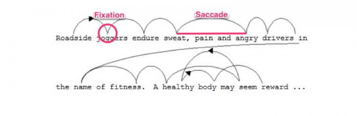
When reading, we actually break sentences up into fragments and after seven or nine letters, our brain need to pause in order to process information. The amazing and paradoxical fact is that no visual processing is happening in your brain while you’re reading.
So why is it actually that important?
Even though it might be surprising, the researchers found that there is a connection between emotions we feel and the way a text looks like. Readers felt bad while reading the poorly designed page while reading information which was well-structured made them feel satisfaction.
The study was made with 20 volunteers, half men and half women. They were asked to read the same newspaper page in two separate versions. The only changes made were related to design: the image placement, font, and layout. Each participant felt the design difference.
The story of fonts
However there is something more that make us perceive differently each font. It is the story behind it and the things related to it. For example, if you see a courirer font, your subconscious will be instantly associating it with something vintage, old and exotic. Even though you might be not realizing, it is because this font was designed to resemble old memos written on type writers. Helvetica is often associated with official letters and forms while Times New Roman and Cambria are often related to books or school texts.
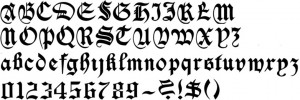
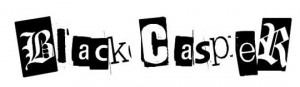
In addition, fonts are grouped in Photoshop by their connotations and history: “serif”, “sans serif”, “monospace”, “decorative”, “blackletter”, “script” and “handwritten”. “Monospace” is a class of typewriter fonts, decorative fonts are strong and they would look like graffiti style while “blackletter” means we have a caligraphy reminding of ancient books. “Serif fonts” is a name for those letters with short lines coming off the edges. For “script” and “handwritten” there is no need of explications.

Short lines
Deciding on a font design is maybe the most important, but it is not enough. We don’t know why and what is actually happening, but when reading, our mind gets a boost of energy when jumping to a new line.
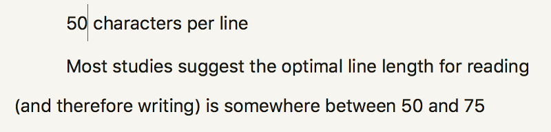
However, if the line length is too short, the rhythm of reading will break because their eyes may feel tired. In order to have a text that feels good, we need to have a line length between 50 to 75 characters. Adequate spacing between letters is also creating a good calligraphy.
If it’s hard to mesure the results of improving your font design when is about a web page, a flyer or a banner, try it with an email newsletter campaign. Pick a font size bigger and a proper class of fonts, pay attention to the line length and spacing between letter, see the differences.
it’s amazing how strong is the connection between choosing a perfect font an building a great brand. it all starts with a logo and a font
If everything is part of a strategy, you have all chances to build a powerful brand.
Each font needs to be part of a design concept.