As you browse through the enormous web, there are websites which don’t fit under any category. These are just professional websites, expressing perfectly the company’s personality and making the user to enjoy the visit. As a user, even if you know a website is there to sell you something, you may love to discover it and search through every page. In order to make your blog or website stand out, here are seven ways to customize your site and make it look professional and friendly.
- Choose Proper Colors
Choosing a perfect equilibrated balance of colors may be difficult. Try to keep it simple. Think about what matches with your logo and choose one or two colors, never more than four. Choose intense colors for important content or titles and bright colors, which usually distract your visitors from the main content of the website, for background information.
- Test User Experience
User experience testing is helpful for web developers to learn which areas of their website are annoying, broken, or could be improved. Consider using not only digital tools, but also your friends and colleagues. Think about some questions and ask people to take a look on your website.
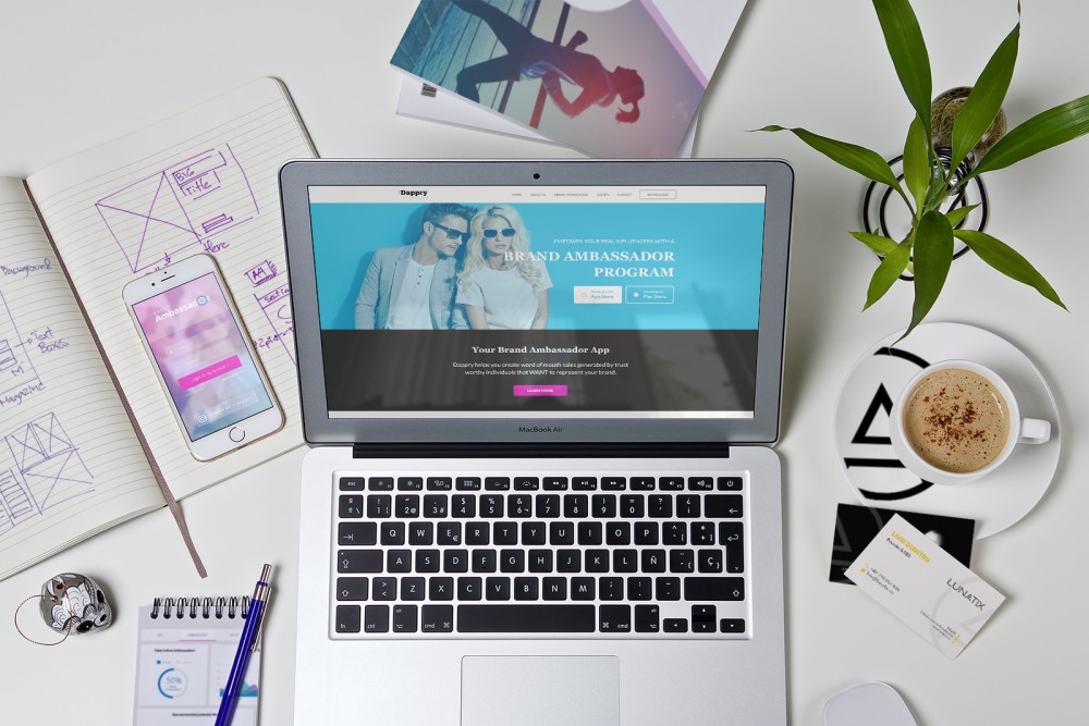
- Make it More Visual
Use a lot of pictures and videos. Every message you have for your audience needs to be first of all visual to be memorable. Don’t be so afraid of unprofessional pictures. A picture of your company staff or yourself should be visible on homepage. It will also increase confidence in your business and make it look more human.
- Think About a Customized Message for the 404 Page
When a link is broken or expired, a cool message could keep your visitor on the website. If Google sends you to a broken page, you’ll probably close it in a few seconds, but if the site owner welcomes you with a funny message, a miracle happens. That is how something annoying is transformed into a nice thing.
Try something like “I know it’s annoying when it happens. You were probably hoping for a cool post about our work. This new stuff is better anyway:” and put some links to other articles.
- Useful Information
Your website should not be crowded out by large navigation bars, excessive use of images getting users confused. All professional websites try to keep it simple and add only information that is useful for your visitors. If you don’t have enough valuable content, it’s okay to leave healthy amounts of whitespace.
- Use Menu Icons
Menu Icons are not only drawing more attention from visitors, but also they make the navigation experience simpler. It’s a fantastic alternative that favors a quick visual identification and it can add depth and personality to your design. The use of icons beside menu items is also a strong, professional branding tool if you design logo-icons, that can be associated with your business domain.
- Mouse-over Effects
Mouse-over effects are a very modern and stylish technique to have the user attention and to create interesting interactions. This is also the simplest way to keep the user on the site for more time just because it’s naturally to want to see what happens when you’re moving the mouse through the page.
Can you help making my website look professional? Would you share some inside tips&tricks?
Even if you are a first-time website owner, you still want your website to look professional. Here are more tips to make your website look professional: 1. Correct Grammar 2. Color Coordination 3. Simple Navigation 4. Typography