Talking about logo design trends is like waking through a minefield. Following trends is not enough to make something that looks good and it’s always a trap that comes with them. When you’re trying to create a logo that you can place in a category, that can be asscociated with a specific style or movement, it becomes instantley less original. That is why this article is not about what we can do, but about what we’re not doing anymore, aiming to create trends not to follow them.
LOGO DESIGN TRENDS - not to follow in 2017
Keep your eyes peeled for these logo design trends in 2017.
Abstract shapes
For the last moths, most of big companies have chosen to replace their logo with a more abstract shape, representing the same old concept, in their rebranding process. One of the most relevant example is Zendesk which have been passing from a lotus flower and a heart shape to a capital Z, created by using rough simple cutted cercle and a triangle. The same thing happens if you take the example of Mastercard or WCS, wehere it has been used an overlapping gradient to mark the lines between shapes.


An anti-serifs movement
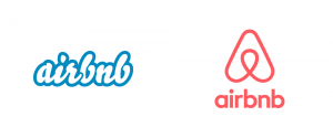
It looks like the entire World has agreed that serif letters are not cool. Google, Airbnb, Mastercard are only the most well-known brands which decided to change the serif letters. However, this trend is global and is followed by all start-ups and small companies which need a logo. That means that we’ll probably get soon bored about minimalist letters and we will pass to something more spectacular and catchy. Most probably, this year will have a new and totally different class of fonts becoming very popular in a short time, writing the history of design.

Simple and artsy lines
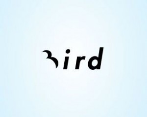
When is about the lines, almost anyone is envying the perfection of the Nike line. However, simple lines are not always easy to draw and if they are, they are not meaningful. Combining simple lines which draw a very abstract symbol or a capital letter with a solid color, you are able to emphasis two or more different visual messages on the same logo. This technique gives us something that we call „negative space” and is both popular and intersting. Creating a double meaning will never get old-fashioned, but the way we do it needs to be always different and surprising.

Excessive gradients
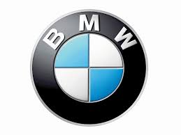
Every clean shape becomes complex and sophisticated when we add a gradient effect. Actually, honestly, this is a logo design technique commonly used for making the job much more simple. It gives a nice spectacular impression at the first look, but sometimes, it is not relevant for the brand or it may even make the logo difficult to reproduce or to read. The perfect version of a gradient is something very discreet, more like a soft light and shadow as we can see at the BMW logo. This time, to create a smart, memorable and unique logo, the gradient effect will need to be used in order not only to produce a different impression, but also to build an original concept and to express the main ideas and values of the brand.

Hand-drawn and vintage
Using hand-drawn letters or a vintage image may be catchy and intersting if it’s related to the brand message. This way, if we have a coffee shop or bar which wants to introduce the customer in a retro atmosphere and which keeps the same idea on its interior design, both techniques will be a real success. On the other hand, we can’t imagine a bank or financial institution doing the same. As any other design technique, hand-drawn letters and vintage icons are relevant to express a distinct feeling or idea associated with the uniqueness of the brand.
There are many other effects and techniques invoked by designers these days, but none of them can be considered a prediction for the future. What’s coming next, we don’t know. However, we’ll probably surprise you. The next generation of logos will be totally different, it will take your breath away, it will make you fall in love again and it will drive you crazy.


I found just what I was needed, and it was ennritaiteng!
Some nice Logo Design Trends! Thanks for sharing!
I don’t get it! Logo Design Trends (Not to Follow in 2017) or Logo Design Trends (To Follow in 2017). So to or not to?
Logo design trends… to follow or not to follow this is the question 🙂
Hot Logo Design Trends That Can Improve Startup And Small Business Brands
Biggest Logo Design Trends. Logos are everywhere, and for those who toil in the mines of design, they are the ideal