Design is an integral part of the success of your digital experience! This is undoubtedly a sentence you have already heard. When it is beautiful, you’ll be probably more likely to like a brand. But how do we know what is beautiful and what is not? Let’s see how is the beauty described at the end of 2017, in terms of design.
Graphic and UX Design Trends
You Should Know About
Vibrant colours
This is considered to be THE trend of the year, which the majority of interviewees spontaneously cited. A reference that set the tone: Spotify, and its “new” identity … dating yet from 2015.
Whether alone or as a duotone, the colors take on and we’re going to see a lot more vibrant colors, tone-on-tone and bold gradations in this year’s user interfaces. Purple with yellow, gold and emerald, flashy gradients covering B & W photos: everything is possible, as long as the design reaches the goal of emerging in an ocean of identities and websites rendered a little too normed, notably under the impulse of responsive and flat design.
This trend eclipses pastel colors and low saturation. And it was confirmed by Pantone when designating the color of the year 2017, greenery”. A natural green certainly, but rather lively!
Creative algorithms
There is “a fundamental tendency to which designers are not sufficiently trained: creation through algorithms, 3D, creative coding”. New techniques that come out of the usual Creative Cloud suite from Adobe (up to an upcoming update?). In other words, it means creating identity, packagings that rely on data visualization. But better than trying to understand through an metaphoric explanation, it is to see it. The idea is not to digitize forcedly physical products, but to bring innovation behind the scenes, bringing meaning. For example, the Google homepage, with a very simple layout, and a very colorful logo. This quasi-childlike interface masks one of the most powerful algorithms in the world “.

No design
A few years ago, it was the era of the skeuomorphism and the evocation of physical, material elements, to represent functions. Our PSDs were overloaded with effects, shadows and textures in all directions. Then came the flat design, carried by the interface Metro of Microsoft then Apple iOS 7, very much criticized at the time.
If 2016 had begun the trend of an enriched flat design, 2017 bet more on no design. This one allows above all to better put forward the content. We assume it, we play. The focus is more on composition and UX. The no design is also found on the packaging side, where one almost forgets the container to better value the content.
Free web typography
By offering a lot of various fonts, most of which can be used free of charge for any type of connected device, Google is inspiring lots of designers. This diversity makes it possible to vary more the “typos” and to dare a customized highlighting of important texts and call to actions.
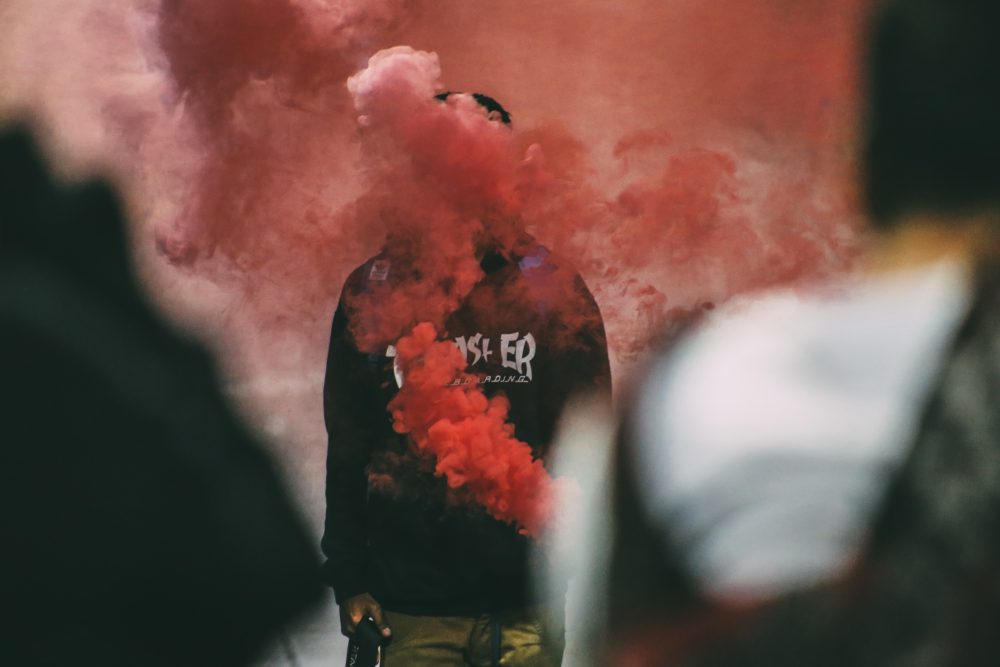
The cinemagraphs
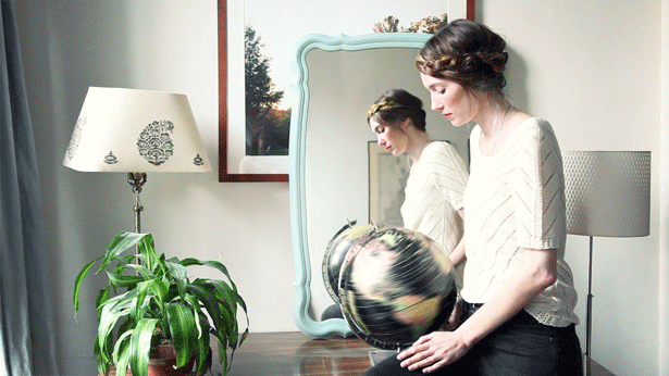
For some time now we have witnessed the emergence of cinemagraphs. They can be considered as the evolution of animated GIF. Their advantage: they combine two main current media that are photography and video. A good way to convey a message or an emotion. Here are some examples to inspire you.
Design Trends 2018? Really?
New trends emerging in the world of design and old ones fading out. 2018 is all about visual contrast.