
Everybody is now visiting websites from their mobile browser. No one doubts today that the use of smartphones is exploding and every business owner begin to realize that now his company needs more than an awesome web design. It needs a responsive web too. But what actually means “responsive design”? Is it a matter of development? It is a matter of design? What are the things that your design should actually take into consideration?
Responsive Web Rules
Design and Development
When discussing with designers you’ll see that “responsive design” is used both:
- For a design that is easy to code and adapt for mobile devices too;
- For a separate design to show exactly what the website looks like on a mobile device.
Now let’s say you are creating a web design without showing a separate mobile view for that. How do you know what the design would look like? Well, this is where a designer begins to show his awesomeness. Although the client doesn’t see and everybody ignores this fact till it’s already coded, a fancy designer is planning from the beginning a composition that should look great on any kind of device.
So what needs to be cosidered at this first phase and how can you actually find out if a design will work on mobile too?
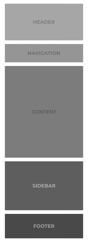
Targeting vital content
No matter what is your project about, the first thing to do will be to organize your content and to classify the importance of different ideas that will correspond with design elements. This way you can start thinking about the different sections and elements, part of your design, such as main content, sidebar, header, and navigation. Each of them can be associated with modules that can be re-organized, re-sized or shuffled without their original significance getting lost.
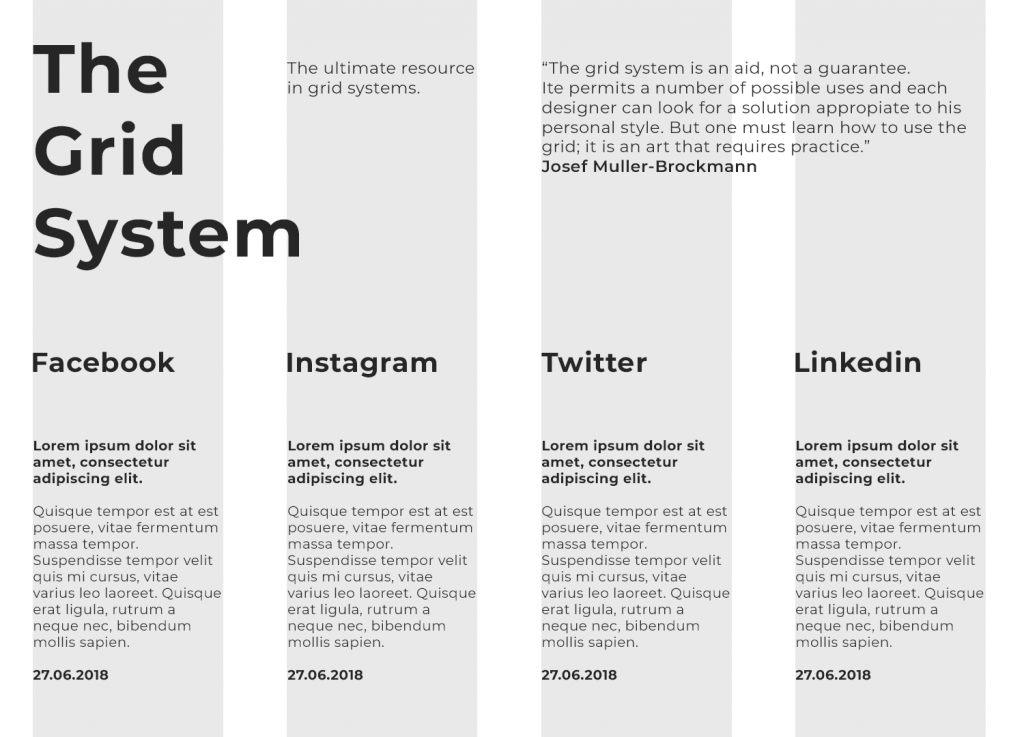
A grid-based design
In addition, this would help you place each section within a grid-based design which will also help developers to follow your design idea while adapting it for multiple devices and screens.
 For example, if your website aims to attract an important number of users, you should consider the login and sign up or get started buttons vital elements. Having this in mind will help you to see what would be the elements that could be hidden on the mobile version or need to stay highlighted.
Flexibility
Flexibility is another key point when building a responsive design. Sounds great, but how can be a design flexible? To do this, you should first of all make it modular so your sections can be placed one below the other and re-organized in a nice manner. On the other hand, if your modules are connected by a certain graphic element, they lost their flexibility.
Meanwhile, some groups of elements like the navigation links for example, may really need to stay together for any layout because of their content. Otherwise they can lose their meaning.
Scaling
A responsive web means actually creating a composition which is so flexible and good enough to be replicated on different screens without changing its structure and idea. So it involves creating some proportions rules. The font dimensions could be one of the best examples. Some designers indicate for example that a certain headline should always be 20pt bigger than body text. When coding, not only is this thinking a big hassle for the coder, it could also damage the entire design. For avoiding this, the guideline should say that the headline needs to always be 1.5 times as big as the body text.
As a consequence, the only thing that is truly influencing the responsiveness is how big or small the text is compared with the other text on the page while a constant value is meaningless.
Briefly, in order to be responsive, a web design needs to organize its vital content in a grid system within modules that should make it flexible. Moreover, you need to think about how to scale your page elements for adapting this on different viewport sizes. However, for doing that it is required a strategic planning of your composition from the beginning.
How cool! This is very very useful. Anything you do needs to be responsive nowadays and probably the reponsive design is as important as a well-done coding.
Good article on Responsive Design. Waiting for more insights!
You should write an article dedicated to Responsive Design Rules. I don t think this cover everything not even 5%, but a good start.
I need more details on what is the difference between a Responsive Design and a Fluid Design please.
Responsive Design vs Fluid Design vs Adaptive Design
Responsive Web Design is about using HTML and CSS to automatically resize, hide, shrink, or enlarge, a website, to make it look good on all devices (desktops, tablets, and phones)