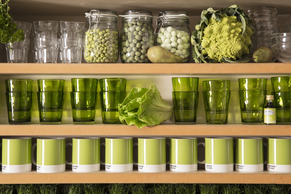
Green energy, green life, green homes, green food, green care products, green cities, green businesses, green festivals, green people. Obviously, according to The Pantone Color Institute and to anyone else, the 2017 color of the year is a color affined to green, named greenery.
The preference for colors which can express the connection with nature and the need for harmony and peace in a chaotic world is very easy to understand. Let’s take a look on why and how it is changing the way we design and create branding campaigns.
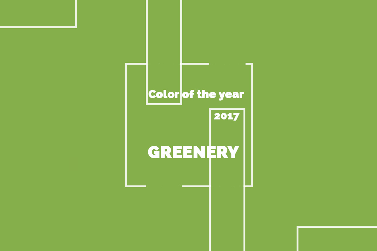
THE PANTONE COLOR OF THE YEAR 2017
In 2017, it’s all so greenery.
Used to inspire
Even thought it might be surprising, greenery is the color of the year expressing also innovation and it may be related to hi-tech solutions. Somehow, the biggest paradox of the ecology movement is that smart solutions used to improve energy efficiency, to replace the traditional gas with biofuels, to create green energy are always related with an innovation in technology.
This way, the new philosophy is combining two opposite ideas: the traditionalism and the return to nature with the modern life which is taking all the benefits of technology. As well as suggesting a new beginning and environmental concerns, greenery is a bold color used for expressing innovation and evolution in building brands for digital companies.
Applications
Expressing a variety of emotions, greenery may be paired with neutrals, metallic, brights, deeper shades or pastels. It is also the color which, paired with red, is creating the most powerful chromatic contrast. Easily to combine and make it look great in different palettes, greenery is used in fashion, beauty, in digital solutions, architecture, alimentation, health and other fields for product and graphic design applications.
As we could see, even Coca-Cola has been green for a few months. So, this means greenery is one of the trends which simply cannot be avoided.
Fashion
Used to create a bold accent, greenery is also between the newest fashion design trends and it’s been seen in recent collections of Kenzo, Michael Kors, Zac Posen and Cynthia Rowley.
Different from Emerald, the 2013’s color of the year, which symbolizes luxury and a rich lifestyle, greenery in fashion is used to be the expression of a traditional lifestyle and to create collections inspired by nature.
Packaging in greenery
When you find a product packaged in greenery, you will probably automatically associate it with something bio, organic or which is at least taking in consideration the environmental issues of our planet. In a world where we are craving for a more natural and simple way of living, buying greenly (or greenerily) is the predictable response of the individual which aims to be respectful to the nature, but he cannot give up the consumerist behavior. As a result, he chooses at least to shop greenly.
After we’ve seen a home-made and ecology philosophy rising within design disciplines, it looks like the 2017 color of the year is greenery. It is easy to explain why. The question is now: “for how long it will be used as it seems to be only the beginning of the green planet era?”
I think greenery, deserves to be the color of the year 2017! Love it!
different types of green will be for long time in top of design preferences, as long as everyone is looking for something eco, something natural and green, it will be the color of the year.
What do you think will be the next Pantone Color of the Year? Thanks
Don’t like the Pantone Color of 2017! Really it’s so ugly! Let s vote for a new Pantone Color, who are they to decide the Color of the year?
Well, Pantone’s Color of the Year 2017 Is Optimistic
Pantone’s Color Of The Year 2017, Greenery, Is Inspired By Monet, Rooftop Gardens